By JENNY ALPAUGH – Print Managing Editor
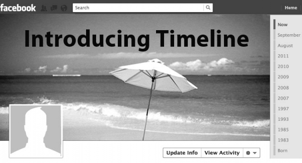
Beginning the week of Aug. 10, all Facebook users were forced to a new kind of profile: Timeline, whether they wanted it or not.
For months, Facebook had been continuously and tactlessly trying to convince all users to convert their profiles to Timeline. Many resisted, but soon found themselves losing the battle, as one by one, when they clicked on their own names, Timeline had invaded their profiles.
An attempt at making profiles more accessible and understand¬able, Timeline does just the opposite. Although it is supposedly showing statuses in a chronological order, this chronology is made confusing by two staggered columns.
The largest and most prominent aspect of the new timeline format is the cover photo, one of the first things that visitors see when viewing a profile. This photo is larger than any other element on the page and allows users to make a statement about themselves. A cover image must be carefully chosen in order to ensure the statement being made is the one a user wishes to make. As many businesses and colleges look at Facebook profiles when deciding whether or not to interview an applicant, the statement made by a cover photo could play a part in determining the fate of a certain job or college acceptance.
Timeline destroys an element of privacy that could be found among the old profile format. Discovering pictures and statuses from a person’s past is now almost too easy. Rather than having to scroll through pages and pages of a user’s profile, only one click can solicit statuses, photos and even “likes” from a specific year.
Though there is a small percentage of Facebook users who are completely content with the new timeline format, most users want to simply have the choice to switch back. Timeline is a more visually appealing way to display what a person is willing to share on Facebook, but the way users were forced into this new profile was anything but appealing to anyone who hopes to have some freedom of choice.
